Nets Danmark A/S
The National Debit Card of Denmark
Brand Refresh
Dankort is the first ever national, electronic payment card. It was launched in Denmark in 1983 and today there are more Dankort cards in circulation than there are Danes.
Dankort is a democratic card. Whether you are a CEO or a cleaner, you have your Dankort in common and the term “På beløbet” (For the value) has become synonymous with paying for something with Dankort. The last two years it has been used more than 1 billion times annually. The brand has undergone several redesigns in the past — the latest in 2015. But over the years, the visual identity for Dankort had become increasingly darker and more corporate. Very far from its intrinsic Danish DNA.
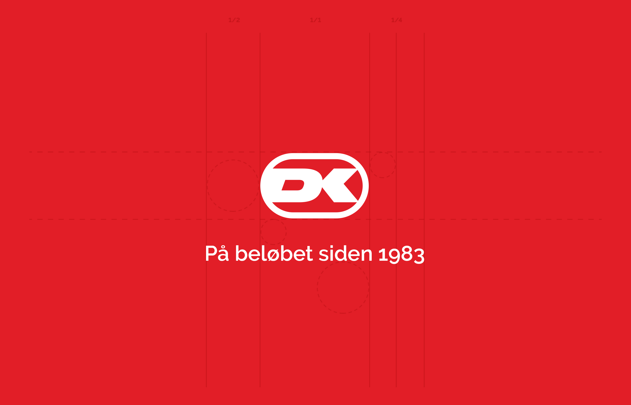
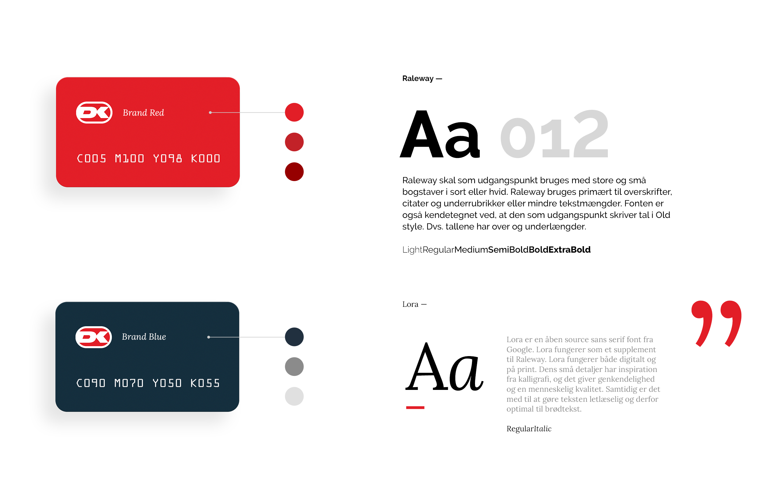
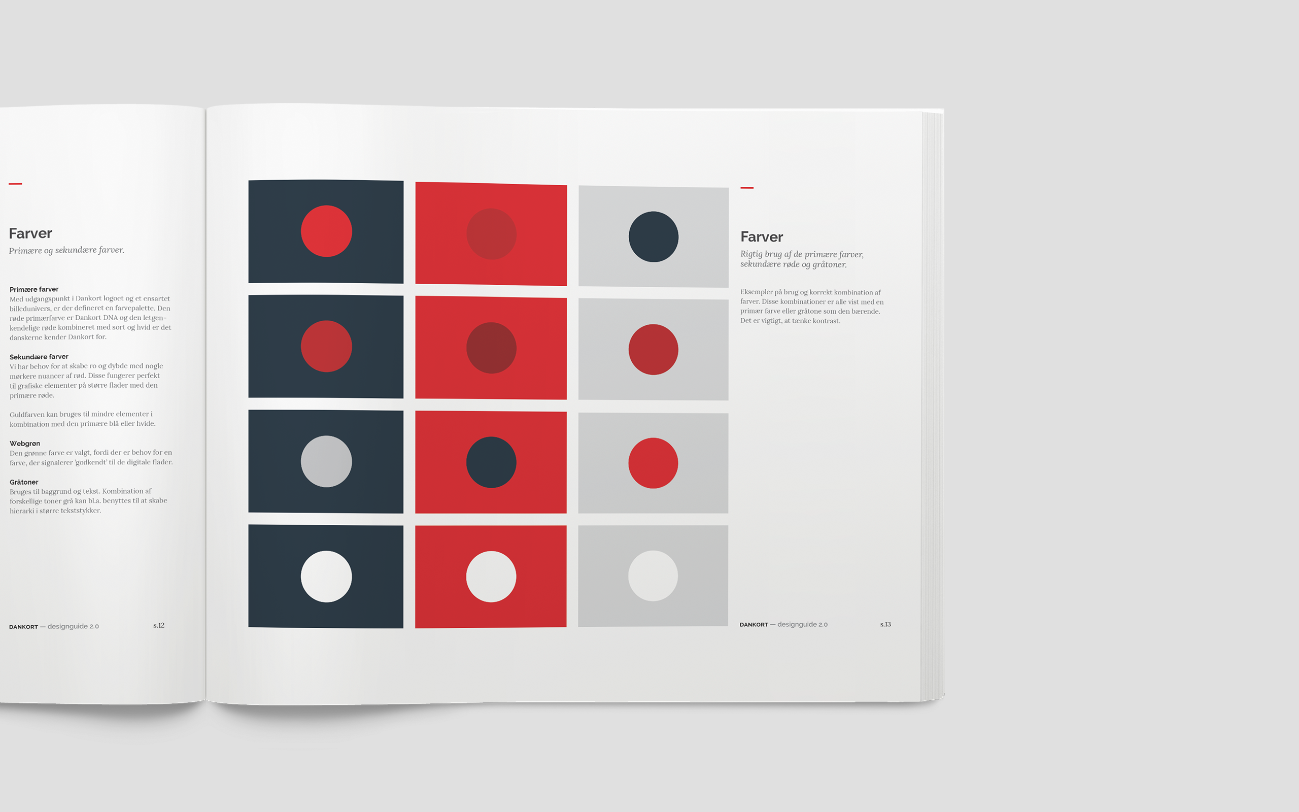
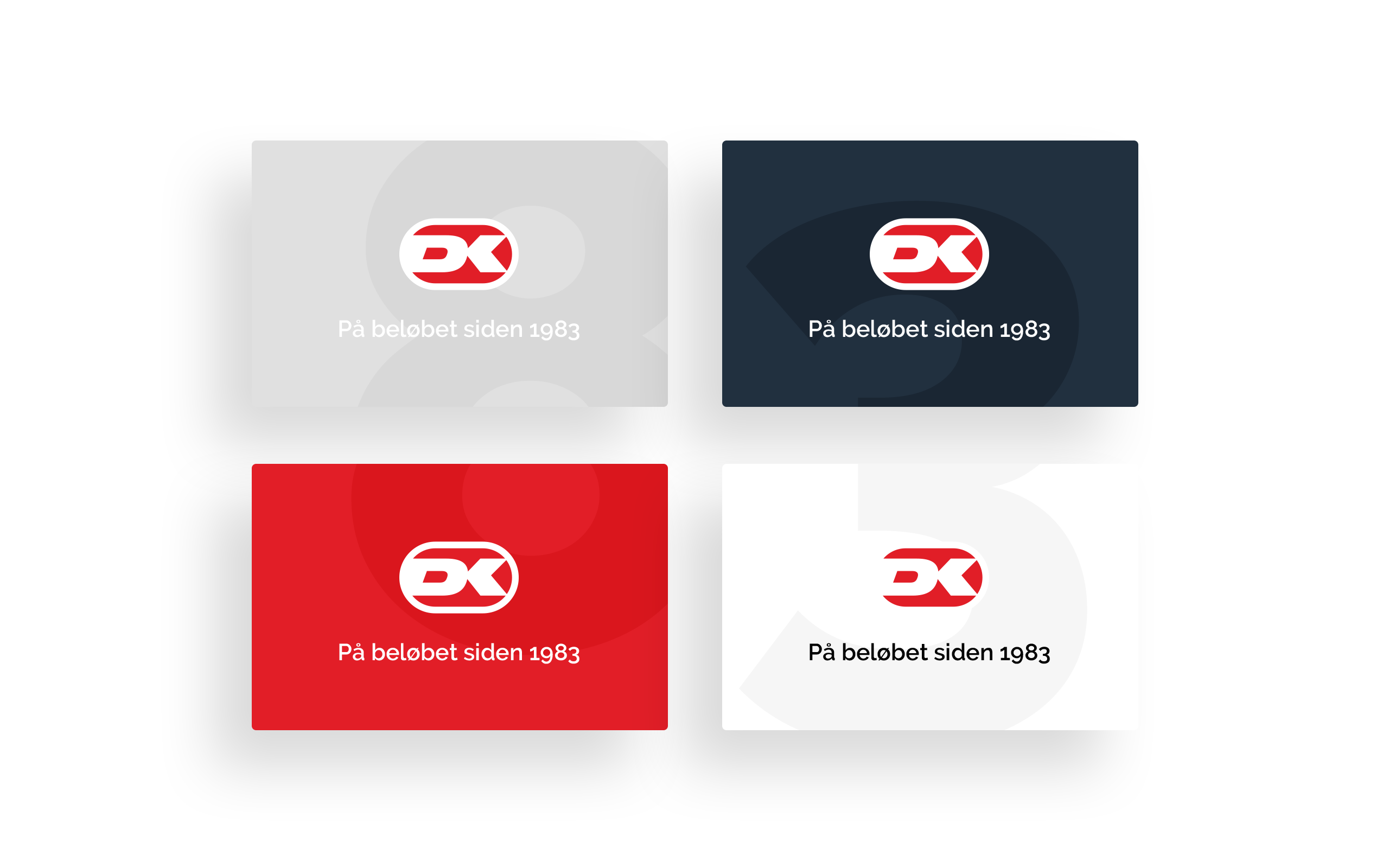
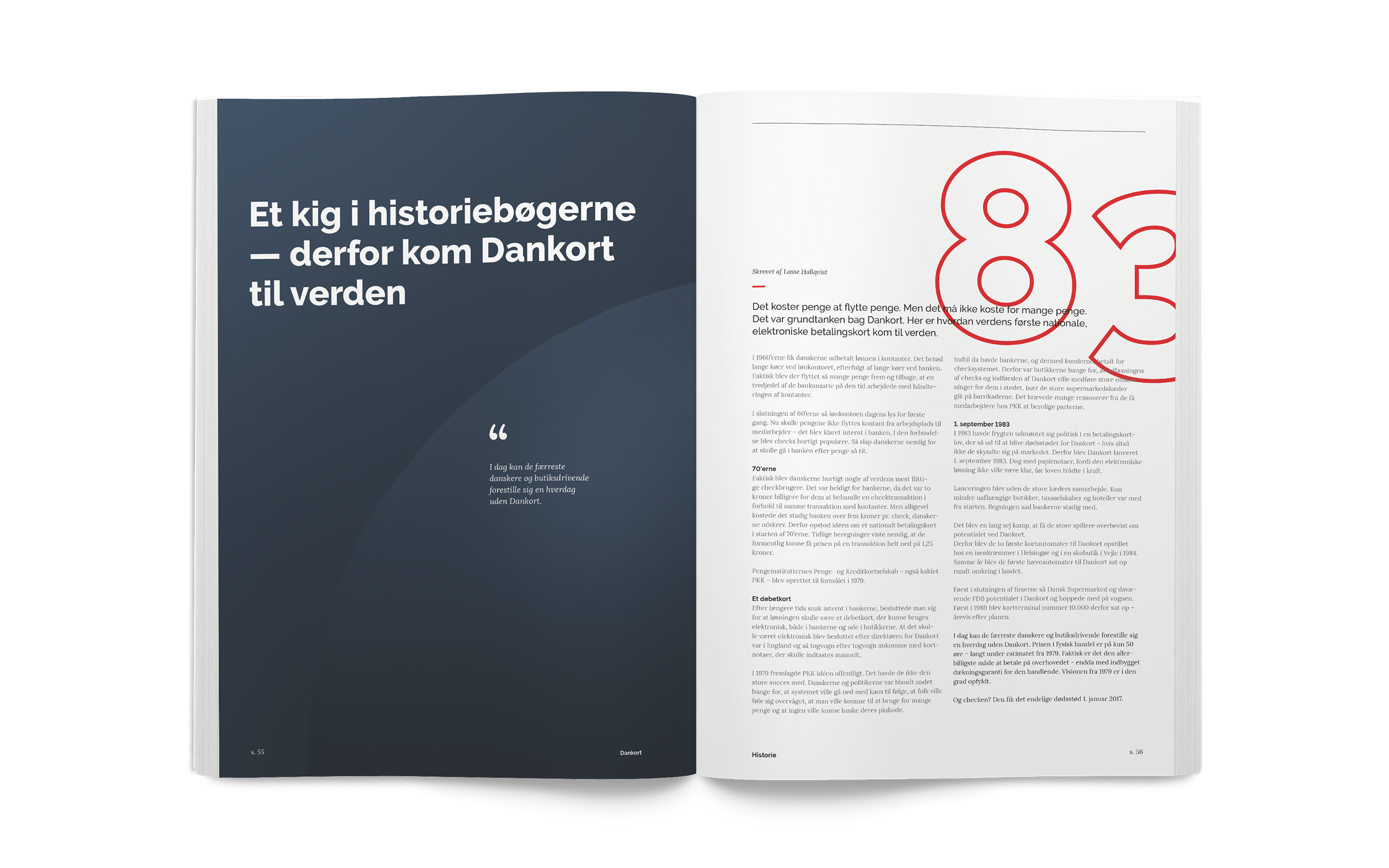
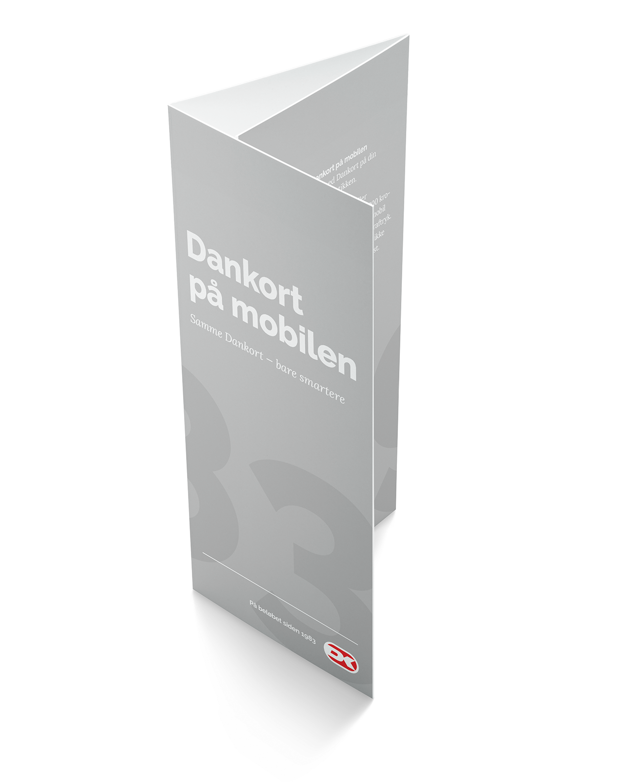
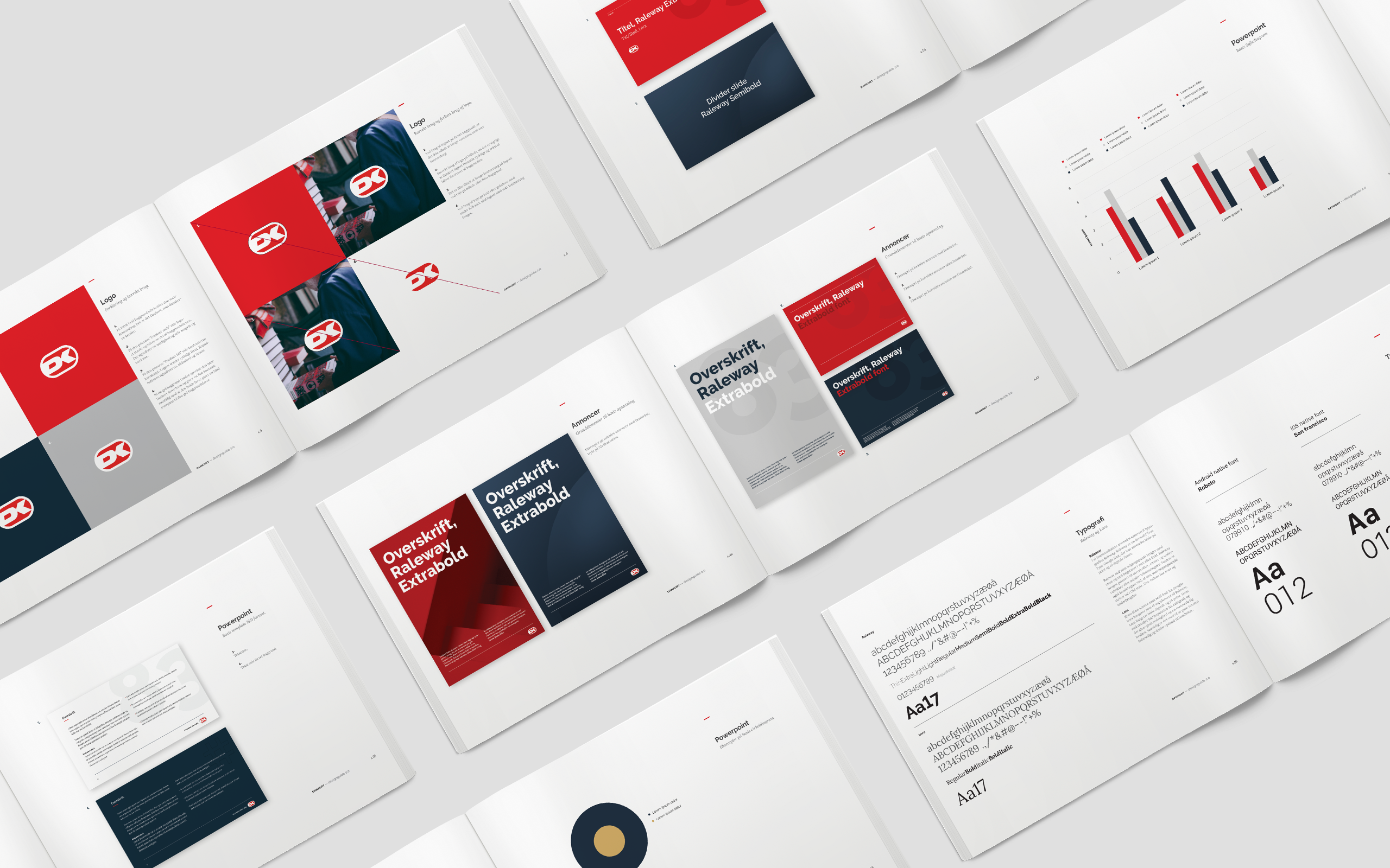
We wanted to change that and take the Dankort brand back to its roots: Dankort is the people’s card; safe, easy and for everyone. We went back to the original Dankort colors: bright white and crisp red. We introduced the tagline “På beløbet siden 1983” (for the value since 1983). We have made an honest and no—frills design, that incorporates the origin story with the subtle use of ’83 and our take on the original flat, inverted red/white logo but in line with todays’ aesthetics.
17
By: BABY






Credits
•
Team
Design Lead:
Rasmus Kristiansen
Creative Director:
Rasmus Laumann
Client Service Director:
Cecilie Friis Jakobsen
Project Manager:
Paulina Hultberg
Copywriter:
Lasse Grosby Hallqvist
3D & Motion Designer:
Victor Hansen
My Contribution®
• Graphic Design
• Art Direction
• Iconography
Rasmus Jappe Kristiansen
Brand & Digital Designer.
Copenhagen, Denmark.
Let's Connect
Contact Info
©2015-2020 All rights reserved.